
The most recent and exciting thing we’ve been working on here at Mondo is the new Ka-Pow! series. For this post, I'd like to talk about how this whole thing even got started, show you guys some development art and my thoughts on how W.A.R. Journal shaped up. So, if you haven't seen Operation: Tiger Bomb yet you might want to go and watch that first here. It's ok, we'll wait for you right here.
Ok, are you back? I grabbed a cookie while you were gone so, now we're both ready to dive into this thang!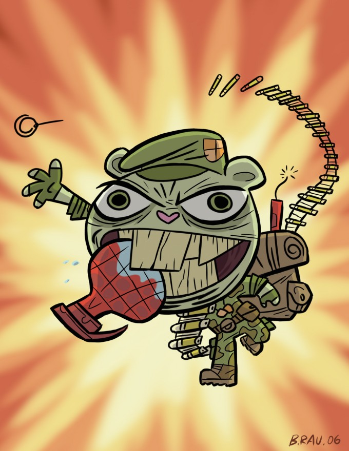
The roots of this series was planted a while back. The year was 2006. The place, San Diego Comic Con. Ghostbot Director Brad Rau did this explosive artwork (above) of Flippy for a contest we were running at the booth. Brad is a HUGE G.I. Joe nerd fan, which totally jumps out of this image and drop kicks you in the face! I love the re-designed on him which made him an all-out soldier, frothing at the mouth for some good, ‘ol fashioned blood shed. It was so awesome that it made me think, "Man, it would be great to do stories of Flippy set back in the past when he was involved in all sorts of military operations." Maybe, not in those exact words as my thoughts usually involve lots of images and traumatic scars from my childhood... the pillows! They're trying to smother me!
Ahem... anyway, chapter forward to 2008. We were looking for something new to do with Happy Tree Friends and take it in a slightly different direction. I looked in the little filing cabinet in my brain and pulled out the idea of turning Brad’s explosive art into a full blown show. It should have action, adventure, excitement, lots of blood and gore and of course, big bada boom!
In the past, I’ve been coy about saying what war Flippy’s been involved in. I didn’t want to peg him in any one conflict because to acquire his level of Post-Traumatic Stress you really need many, many, MANY different wars! What we’re hoping to do in W.A.R. Journal is to peel those old scars open and see all the nasty stuff that Flippy has had to endure that made him the bear that you all love today.
In starting up the new series, we wanted to give each title it's own unique look and feel which would differentiate it from the regular series as well from each other.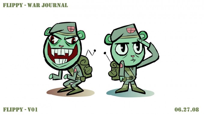
Above is the first pass at Flippy's design for animation. Of course, we didn't want to stray too far off Flippy's original design. It's still heavily based on Brad's artwork but also simplifies his look for animation production. We don't usually use black outlines for the characters but Brad's idea is that it would hark back to old-school pulp comics like Sgt. Rock. The rough, sketchy line also was the perfect choice that made the characters look even grittier and, literally, "rough around the edges!"
Although, 90% there, I had some minor tweaks that I requested Brad address. Firstly, I was hoping to break up some his colors so he wasn't so monochromatic. Second, I asked that the flipped-out version of Flippy have rougher outlines, more sketchy, sharper corners and a broader upper body to give a good contrast between the transformation that he goes through. They're small, subtle cues since he doesn't completely turn into a different creature like, say The Hulk. Just something to help the visuals along and make him look even more maniacal and crazy!
Everyone assumes that Flippy was a lean, mean, fighting machine back in the day and that certainly would be the straight way to play it but I like the going against the grain and make him actually kind of a clumsy and incompetent dope when he's not flipped-out. That doe-eyed looking good version of Flippy certainly conveys that. He really is an innocent and kind soul at heart that has seen and experienced more tragedy than one creature can handle. The contrast between that and the monster he becomes just make him that much more interesting and, hopefully, funny!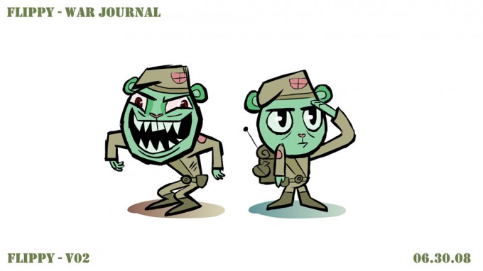
Here's the second revision where Brad knocks it out of the park! Evil Flippy looks meaner and even more deranged. Target hit! Just some quibble color refinement and we've got our star!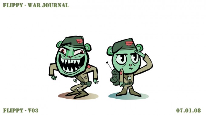
Third time is the charm! We refined the colors of his uniform to break up colors even more, giving Flippy splashes of green on his brown uniform and saturating the reds a little more to bring them up slightly to give some interest and variation. Ship it!
Another great thing about the new Ka-Pow! series is that we get to create new characters! For the first episode, we thought we would give Flippy some squad mates as he fights the Tiger Army. Writers Ken Pontac, Warren Graff, as well as Alan Lau, Brad and I originally planned for four other members of his team but ultimately decided to trim it down to two because it worked better with the story and timing. Not to worry, we’ll see other quirky and memorable compatriots pop up in future episodes. In fact, W.A.R. Journal isn’t strictly a Flippy series. Originally titled "Flippy's War Journal" and "Flippy's Flashback," I dropped the "Flippy" and changed it to simply "W.A.R. Journal" because I wanted the freedom to do stories that don't just center about Flippy but also give time to the other characters as well. I'd love to dedicate some episodes to Mouse Ka-Boom or Sneaky and other whacked out personalities. Heck, there might even be episodes without Flippy in it!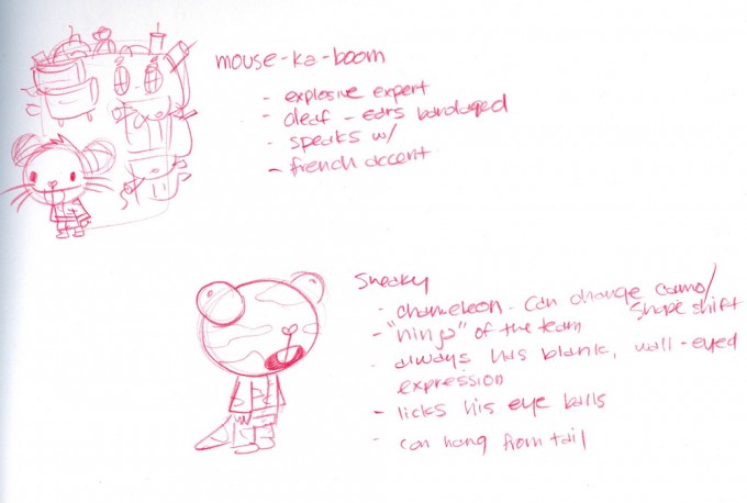
I'm throwing all caution into the wind and posting this crude, CRUDE sketch (above) I sent Brad to communicate with him the idea for our two new cast members. Mouse Ka-Boom was originally supposed to be a big, burly rhino, the stereo-typical demolition man. The more we talked about him the more we felt like that was too on-the-nose. We finally decided to go against type and make him a little mouse with a giant back-pack FULL of explosives! What could go wrong? I also thought it would be hilarious to make him deaf from all the explosions he's been around. None of you probably knew that since we didn’t play it up in the first episode (it explains the bandages around his ears) but I assure you it will become an issue in episodes to follow. I just love characters with tragic flaws because we can mine so much comedy from it.
The second character, Sneaky, actually came before Mouse Ka-Boom. He didn't change much from concept to final design (although Brad made him look even better!). I always thought it would be fun to have a chameleon character that would do all the sneaking and stealth aspects of the mission. The fact that he can change his skin color and pattern as well as his long, prehensile tongue should afford us many, many fun gags with him in the future. And since I subscribe to Homer Simpson's formula of naming characters what they are + the letter "y" = "Sneaky" was born!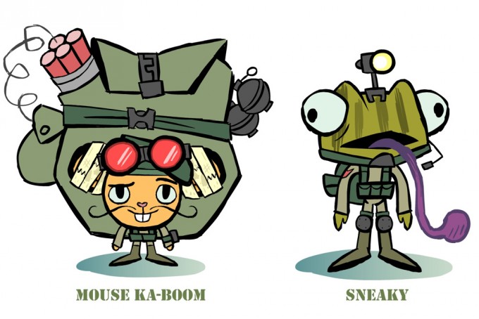
Let's talk bad guys! For Operation: Tiger Bomb, I wanted to give Flippy a real run for him money. Up until this time, nobody's really been able to go toe-to-toe with our brawling bear (except for himself). So, we wanted to create a bad-ass villain that can actually have a decent fight with Flippy. We never really came up with a name for the big boss other than calling him "The General." Here's Brad's first pass at the design.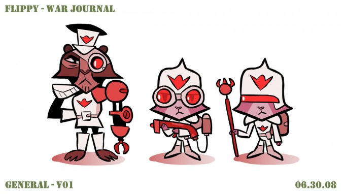
These guys look great but they didn't really fit into the rough and tumble world that I had in mind for this title. Brad's take was that they should feel like classic James Bond villains, which was a good idea but this design looked too futuristic to me, like they stepped out of a 70's sci-fi movie. So, it was back to the shop for some re-tooling.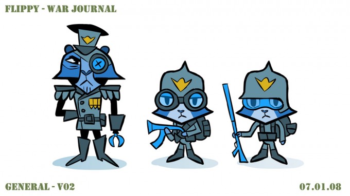
This next version (above) is spot on! They look more like regular soldiers that Flippy would fight. Despite my protest, Brad kept The General's claw hand, but I'm glad he did because it gave him enough distinct features to make him that much more memorable. We're still getting that classic James Bond bad-guy flavor but it fits much better in the world that Flippy is set in.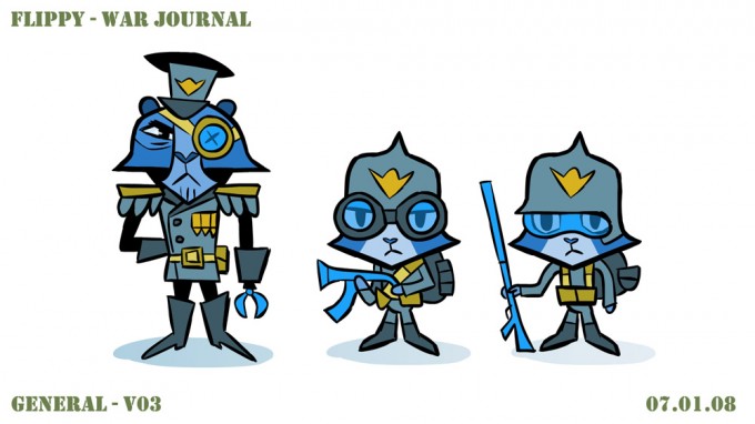
This last pass was for color styling. Again, just broke up some of the colors a little and splashed some more yellows all around to balance. They're ready for war!
One issue that we went back and fourth on was whether or not these guys should be carrying guns since we do not have guns in the regular series. Guns don't fit in the idealized world of Happy Tree Friends. Plus, they're too easy. There's not a lot of imagination involved with how chaos and violence happens once guns are introduced into the mix so one of the rules that we have in Happy Tree Friends is that guns are not allowed! It's much more fun to come up with ways Flippy can kill with, say a flower rather than with a gun. However, for W.A.R. Journal, I think we'd be hard pressed to tell war stories without guns. It's just part of the genre. So, we did a compromise; Brad made the guns really simplistic and cartoon like. If you'll notice too, you never see anybody fire the guns in the episode. They have it, carry it around and you may even see gunshots and bullets flying but we plan on never having anybody die directly from gunfire. Where's the fun in that?
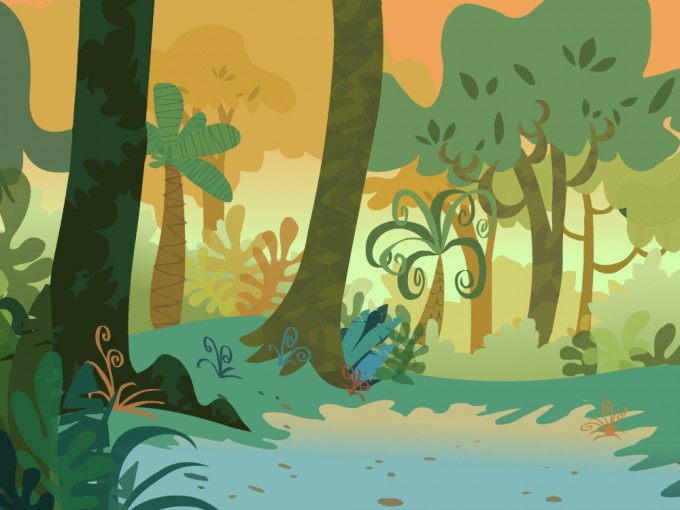
I want to also do a special mention to Brad Gake for designing the AMAZING backgrounds in W.A.R. Journal along with Leticia Lacy doing the colors. It's a one-two combo punch in the face while clutching a loaded grenade! Explosive!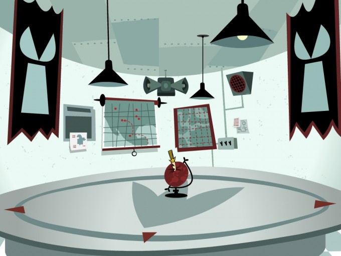
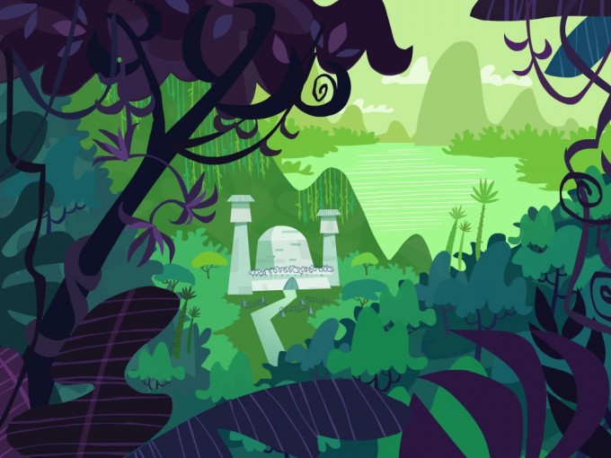
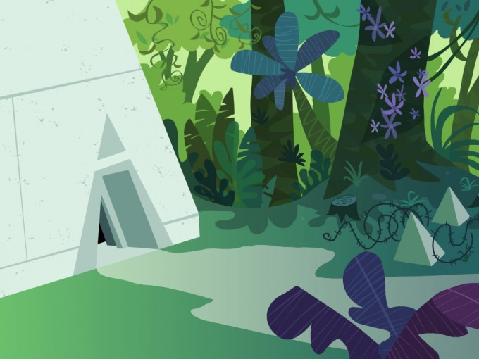
So, take all those elements together, throw them in a cannon, aim it at the computer and FIRE! Once you sift through the wreckage you'll find all the animation done... albeit a little burned and battered (if it were only that simple... or as painless). Actually, Ghostbots Alan Lau, Roque Ballesteros and Brad with back-up from Sam Chi, Jayson Theissen, Kris Toscanini and Jeff Biancalana (yes, the one and the same voice for Russell/Buddhist Monkey. He's multi-talented and I hear double jointed!) toiled in dungeons and caves (their natural habitat) to breathe life (and deal out death) to all of the characters.
As in any production, there are always a few unsung heroes. I may have missed a few people (please forgive me if I did) but one person that I have to mention is Ghostbot Producer extraordinaire Corrine Wong! She holds this giant Katamari ball together and keeps the madness rolling to the finish line. Corrine makes sure that we're all on schedule and budget (no small feat. It's like wrangling a bag of rabbid kittens in a sack!) and that the work actually gets done. As artists, we tend to noodle and linger on some things (we have very short attention spans) so, we need somebody looking at the big picture, cracking the whip to help us to move forward. Actually, Corrine is awesome because her whip is soft and fluffy!
Of course, Jim Lively, Sound Designer extraordinaire, did all the pops, snaps and cracks as well as mixed the audio so you can hear every little bone break or feel the big explosions in the pit of your gut. Fearless and multi-talented Music Composer Jerome Rossen provided the bombastic music that's so glorious it makes you want to start your own personal war!
Hopefully, you enjoyed the episode (and this blog) as much as we did working on it. I've got plans for our psychologically tattered veteran going forward so I hope you all stick around and sign up for a second tour of duty!
'Till all are one!